
We’ve built the entire PeerJ platform from scratch – the submission areas, the review area, and the publication areas. This is in contrast to most publishers that use hosted or licensed services for each of those three areas (submission, review, publication). We went to the trouble of doing this for two reasons:
- Rapid iteration – Using hosted or licensed solutions means you have to wait in line for updates to happen. That is way too slow in today’s consumer-Internet driven expectations world.
- Every thing we looked at was massively outdated (both design and function) and in serious need of upgrades to match what a publisher starting out in the 21st Century should look like.
So far, we’re making good on our promise to rapidly update the site for authors submitting, editors reviewing, and readers viewing the logged out pages. To highlight just one area in particular, here’s the frontpage “timeline” as it stands today:
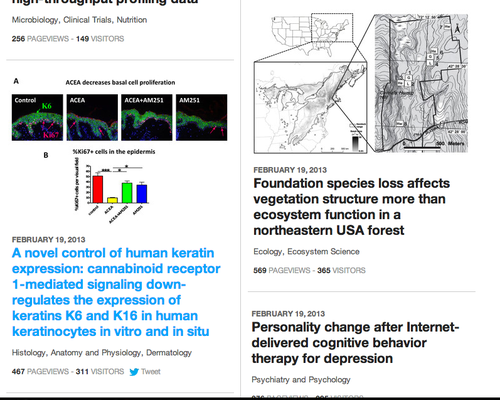
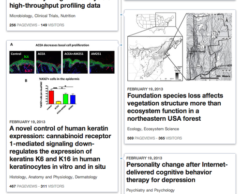
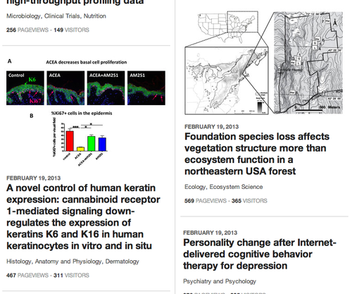
Above: PeerJ timeline on frontpage as of today. The blue text shows a “mouseover” state for that particular article.
THE RATIONALE OF THE PEERJ TIMELINE
With the rise of Google Scholar and PubMed, academics very rarely go to the frontpage of a journal to find their literature these days. When they do go, it is to peruse the table of contents in text based form. If you go to most journal frontpages today then you will quickly realize why this might be, they look like relics from the 1990s. They are not enjoyable to browse, so using PubMed or Google to get in and out as quickly as possible makes sense. We wanted to change that.
We still expect academics to use search aggregators like Google and PubMed to find PeerJ content, but modern sites today try to give the user a slightly better experience if they are in a lazy browsing mood. That’s the aim of the PeerJ timeline – “lazy browsing” – for both desktop and mobile experiences. For more serious browsing, we still have the straight text view that can be used.
We also didn’t set out to please everyone, because that’s impossible with design. That said, we did want to create emotion. An apathetic response would be failure. We think we were successful here as some people came out to say they loved the timeline, while others not so much (euphemism). This is good, as it means people are noticing, reacting, and participating … exactly what we’re trying to do with PeerJ. Some things we play safe, like industry standard archiving and security, while others we want to experiment on, as you cannot advance things by always playing it safe.
The first iteration of the PeerJ frontpage was actually laid out last Spring in 2012.
Above: concept of PeerJ frontpage ~May 2012. Never made it out the door.
The original concept was a horizontal based timeline. There are many beautiful images used in research articles, so we thought that could be used to make lazy browsing a bit more enjoyable. When we finally started testing actual usage in January 2013, just one month before launching the first publications, it seemed the horizontal view wasn’t the best for small viewports (e.g. on phones). A good exception to this is Flipboard, which uses horizontal ‘flipping’ to browse through stories. Let’s be honest though, we’re not Flipboard and they’ve really spent years on their design.
Enter the vertical timeline.
Above: Timeline view one week post launch February 12, 2013.
With a vertical timeline users of any device size could more easily scroll and load more articles. In the original concept designs (not shown) we used what we thought were representative images that we would show from articles. The translucent caption overlays worked well with the concept images. In reality however, after launching and seeing multiple real articles we started to think that this wasn’t working as well as it could. For one, we actually have three different views depending on the images available in an article.
- Articles without images
- Articles with just simple line drawings
- Articles with beautiful images.
The design needs to take all three article types into consideration, and the launch day design was falling short. Even with beautiful images, the typography and overlays were not mixing as well as we had hoped in real life.
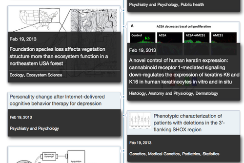
Above: First post-launch iteration
In our first post launch iteration, we stopped overlaying the captions on top of the images. We just moved them down to show off more of the image (again in concepts with beautiful images the overlays worked, but not when you started viewing dozens with real articles).
There’s still a lot going on with the design, however. Research articles often have very busy images. Throw in a busy looking design with dark backgrounds, borders, etc and it just becomes too much. PeerJ Charlie wasn’t happy.
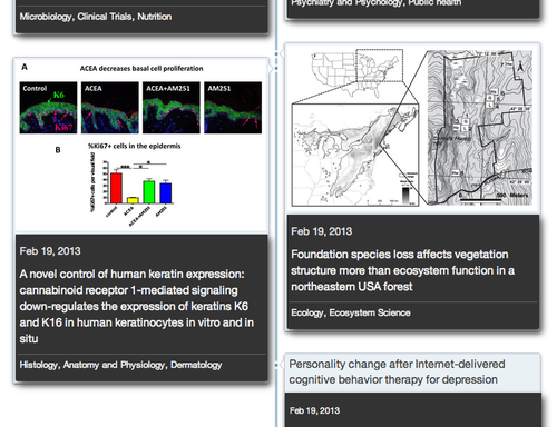
Above: Second iteration post-launch.
In the next iteration we removed the dark background and increased title font size to be more inline with modern design techniques. Subtle grayscale color changes for different metadata sections also aim to improve typography. We also started adding in the first usage metrics for each article. Articles with or without images look more consistent than previous iterations of the timeline. However, the boxed look means there is still a lot going on with the already busy images.
Above: Third iteration post-launch and today’s update.
Today we’ve released the next iteration, which greatly simplifies things by removing the bordered boxed look. Hovering over an article section also brings a tweet button into view (hidden by default to preserve simplicity and not overwhelm the user). It’s highly likely that we will continue to iterate on this as we learn what works best.
Like any modern startup, it’s not just what looks or feels good, but what the actual user data tells you. One of the things we look at is how much time is being spent on the frontpage with each iteration, as well as click throughs. And of course getting direct feedback from users. This helps shape future design work.
This just scratches the surface of all the things we are doing with the PeerJ site, so keep an eye out for future posts. We think that over time, even if we don’t get things right today, that having our own platform will greatly benefit authors, editors, and readers as we continue iterating.